


What Are the Key Design Considerations for Creating a Durable and Aesthetically Pleasing Deck of Custom Playing Cards?
Release Time : 2026-04-10
The creation of a custom playing card deck is a sophisticated endeavor that sits at the intersection of graphic design, material science, and industrial engineering. While a standard deck of cards is often taken for granted as a ubiquitous commodity, a custom deck is a bespoke product designed to evoke emotion, convey a brand identity, or enhance the performance of a cardician. To successfully produce a deck that is both durable and aesthetically pleasing, creators must navigate a complex series of decisions. These range from the mathematical precision of the design files to the tactile chemistry of the inks and papers used. The ultimate goal is to create a product where the visual allure matches the physical longevity, ensuring the deck survives not just the shuffle, but the test of time.
The journey begins with the digital canvas, where the most critical technical consideration is the management of color and space. Designers must work within the CMYK color model rather than the RGB model used for screens, as this ensures that the vibrant colors seen on a monitor translate accurately to physical ink. A common pitfall for novices is neglecting the "bleed" area—the extra margin of design that extends beyond the cut line. Without a sufficient bleed, typically at least 3 millimeters, slight shifts during the high-speed cutting process can result in unsightly white edges on the finished cards. Furthermore, the design must account for the "safe zone" or live area, ensuring that critical elements like indices and pips are not trimmed away or lost in the curvature of the card during handling.
Beyond the technical setup, the aesthetic design must prioritize readability and function alongside artistic expression. A deck may feature stunning, intricate illustrations, but if the indices (the numbers and suit symbols in the corners) are illegible or lack sufficient contrast, the deck fails its primary purpose. Designers must consider how the cards will look when fanned out in a hand, ensuring that the borders are consistent and the center pips do not visually clash with the background patterns. For card magicians and serious gamers, the symmetry of the back design is also paramount; it must be perfectly balanced to avoid "tells" that could reveal the orientation of the card. Thus, the design phase is a balancing act between artistic flair and ergonomic utility.
Once the visual design is finalized, the focus shifts to the physical anatomy of the card, starting with the paper stock. The durability of a deck is largely determined by the weight and composition of the paper. Standard playing cards usually range between 280gsm and 330gsm. A lighter paper may feel flimsy and cheap, while a heavier stock provides a premium, substantial feel but can be more difficult to shuffle in large quantities. The core of the paper is equally important; high-quality cards often feature a black core or a blue core sandwiched between layers of white paper. This opaque core prevents light from passing through the card, ensuring that the design on the back cannot be seen through the face of the card—a crucial factor for fair play and professional performance.
The finish of the card is the invisible variable that dictates the handling characteristics. This is where the "air-cushion" or linen finish comes into play. This texture, which resembles a fine cross-hatch pattern, is embossed onto the paper to create tiny air pockets between cards. This finish reduces friction, allowing cards to glide over one another smoothly during a shuffle and making it easier to fan them out. Without this texture, cards might stick together due to humidity or static electricity. The choice of finish—whether it is a traditional linen, a smooth matte, or a high-gloss varnish—fundamentally alters the tactile experience, making it a primary consideration for anyone prioritizing performance.
Protecting the artwork and the paper itself requires the application of specialized coatings. The industry standard for premium decks is often a varnish applied via a silkscreen process. This coating acts as a shield against dirt, oils from fingers, and moisture, significantly extending the lifespan of the deck. A high-quality varnish provides a "snap" and resilience that uncoated paper lacks. Some manufacturers also offer embossing or spot varnishes, where specific parts of the design (like a logo or a central figure) are raised or given a different texture. These tactile enhancements not only add a layer of sophistication and aesthetic appeal but also contribute to the durability by adding physical depth to the surface.
The printing method itself is a major factor in the final quality. Offset printing is generally preferred for playing cards over digital printing because it offers superior color fidelity and sharpness. Offset printing uses plates to transfer ink, allowing for consistent density and the ability to print fine details that digital printers might miss. For creators seeking a truly unique aesthetic, alternative printing methods such as foil stamping or letterpress can be employed. Foil stamping adds metallic or holographic elements that catch the light, while letterpress creates a deep, tactile impression in the paper. These specialty techniques elevate a deck from a simple game tool to a collectible art object, though they must be used judiciously to ensure they do not interfere with the card's stackability.
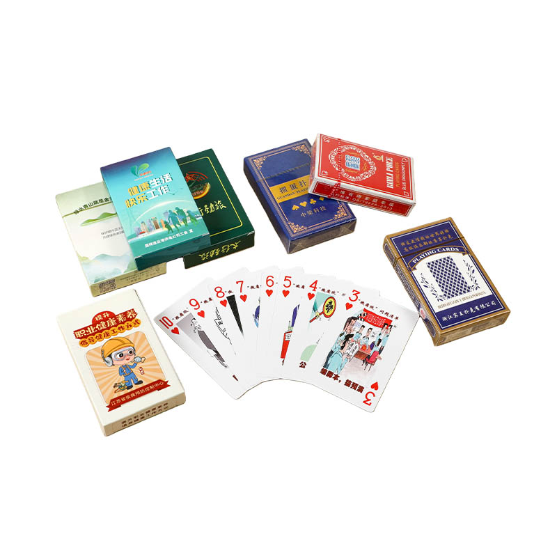
Packaging is the final frontier of design and durability. The tuck box is not just a container; it is the first physical interaction a customer has with the product. A well-designed box uses high-quality cardstock with a matte or soft-touch laminate to protect the printed graphics from scuffing during shipping and handling. The structural design of the box, including the tuck flaps and the seal, must be precise to ensure the deck remains secure. For collectors, the packaging often includes custom seals and interior designs that mirror the theme of the cards, creating a cohesive unboxing experience. A sturdy box ensures that the cards inside are protected from crushing, maintaining their pristine condition until the moment they are opened.
In conclusion, creating a durable and aesthetically pleasing deck of custom playing cards is a holistic process that requires attention to detail at every stage. It requires a harmonious relationship between the digital art, the physical materials, and the manufacturing processes. By carefully selecting the right paper stock, applying the correct finish, ensuring color accuracy, and protecting the product with robust packaging, creators can produce a deck that delights the eye and withstands the rigors of play. The result is a product that feels as good in the hand as it looks on the table, embodying the perfect fusion of form and function.
The journey begins with the digital canvas, where the most critical technical consideration is the management of color and space. Designers must work within the CMYK color model rather than the RGB model used for screens, as this ensures that the vibrant colors seen on a monitor translate accurately to physical ink. A common pitfall for novices is neglecting the "bleed" area—the extra margin of design that extends beyond the cut line. Without a sufficient bleed, typically at least 3 millimeters, slight shifts during the high-speed cutting process can result in unsightly white edges on the finished cards. Furthermore, the design must account for the "safe zone" or live area, ensuring that critical elements like indices and pips are not trimmed away or lost in the curvature of the card during handling.
Beyond the technical setup, the aesthetic design must prioritize readability and function alongside artistic expression. A deck may feature stunning, intricate illustrations, but if the indices (the numbers and suit symbols in the corners) are illegible or lack sufficient contrast, the deck fails its primary purpose. Designers must consider how the cards will look when fanned out in a hand, ensuring that the borders are consistent and the center pips do not visually clash with the background patterns. For card magicians and serious gamers, the symmetry of the back design is also paramount; it must be perfectly balanced to avoid "tells" that could reveal the orientation of the card. Thus, the design phase is a balancing act between artistic flair and ergonomic utility.
Once the visual design is finalized, the focus shifts to the physical anatomy of the card, starting with the paper stock. The durability of a deck is largely determined by the weight and composition of the paper. Standard playing cards usually range between 280gsm and 330gsm. A lighter paper may feel flimsy and cheap, while a heavier stock provides a premium, substantial feel but can be more difficult to shuffle in large quantities. The core of the paper is equally important; high-quality cards often feature a black core or a blue core sandwiched between layers of white paper. This opaque core prevents light from passing through the card, ensuring that the design on the back cannot be seen through the face of the card—a crucial factor for fair play and professional performance.
The finish of the card is the invisible variable that dictates the handling characteristics. This is where the "air-cushion" or linen finish comes into play. This texture, which resembles a fine cross-hatch pattern, is embossed onto the paper to create tiny air pockets between cards. This finish reduces friction, allowing cards to glide over one another smoothly during a shuffle and making it easier to fan them out. Without this texture, cards might stick together due to humidity or static electricity. The choice of finish—whether it is a traditional linen, a smooth matte, or a high-gloss varnish—fundamentally alters the tactile experience, making it a primary consideration for anyone prioritizing performance.
Protecting the artwork and the paper itself requires the application of specialized coatings. The industry standard for premium decks is often a varnish applied via a silkscreen process. This coating acts as a shield against dirt, oils from fingers, and moisture, significantly extending the lifespan of the deck. A high-quality varnish provides a "snap" and resilience that uncoated paper lacks. Some manufacturers also offer embossing or spot varnishes, where specific parts of the design (like a logo or a central figure) are raised or given a different texture. These tactile enhancements not only add a layer of sophistication and aesthetic appeal but also contribute to the durability by adding physical depth to the surface.
The printing method itself is a major factor in the final quality. Offset printing is generally preferred for playing cards over digital printing because it offers superior color fidelity and sharpness. Offset printing uses plates to transfer ink, allowing for consistent density and the ability to print fine details that digital printers might miss. For creators seeking a truly unique aesthetic, alternative printing methods such as foil stamping or letterpress can be employed. Foil stamping adds metallic or holographic elements that catch the light, while letterpress creates a deep, tactile impression in the paper. These specialty techniques elevate a deck from a simple game tool to a collectible art object, though they must be used judiciously to ensure they do not interfere with the card's stackability.
Packaging is the final frontier of design and durability. The tuck box is not just a container; it is the first physical interaction a customer has with the product. A well-designed box uses high-quality cardstock with a matte or soft-touch laminate to protect the printed graphics from scuffing during shipping and handling. The structural design of the box, including the tuck flaps and the seal, must be precise to ensure the deck remains secure. For collectors, the packaging often includes custom seals and interior designs that mirror the theme of the cards, creating a cohesive unboxing experience. A sturdy box ensures that the cards inside are protected from crushing, maintaining their pristine condition until the moment they are opened.
In conclusion, creating a durable and aesthetically pleasing deck of custom playing cards is a holistic process that requires attention to detail at every stage. It requires a harmonious relationship between the digital art, the physical materials, and the manufacturing processes. By carefully selecting the right paper stock, applying the correct finish, ensuring color accuracy, and protecting the product with robust packaging, creators can produce a deck that delights the eye and withstands the rigors of play. The result is a product that feels as good in the hand as it looks on the table, embodying the perfect fusion of form and function.