


How do the surface effects of self-adhesive labels enhance a product's premium feel?
Release Time : 2026-01-15
In the first few seconds of a consumer's encounter with a product, visual impressions often determine the direction of their purchase intention. In this silent dialogue, self-adhesive labels, though small, play a crucial role. They are not only carriers of information but also external expressions of brand personality. Especially when labels employ carefully designed surface effects—such as matte textures, metallic sheen, spot UV coating, hot stamping, or transparent windows—they can subtly elevate the overall tone of the product, giving it a "premium" feel beyond its price.
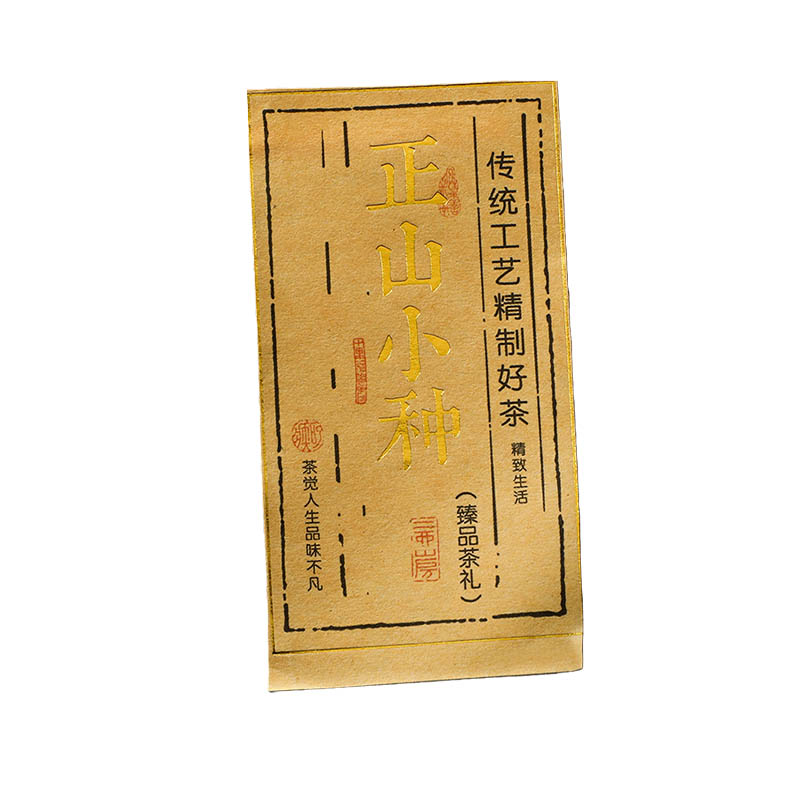
This premium feel stems first from the delicate fusion of materials and textures. A label made of high-grammage art paper or special synthetic materials, with a soft-matte finish, feels warm to the touch without reflecting light, conveying a low-key and understated elegance. In contrast, ordinary glossy coated paper, while vibrant in color, easily appears cheap. Matte, fabric-textured, pearlescent, and other special surface treatments, through subtle light diffusion, present rich variations in texture from different angles, making the product appear sophisticated and refined on the shelf. The moment a consumer's fingertips lightly touch the product, the delicate, substantial, and smooth texture subconsciously builds trust in its quality.
Furthermore, the clever use of subtle details can create visual focal points and a luxurious atmosphere. For example, a gold-stamped brand logo against a dark background gleams subtly under light; or UV-embossed ink is layered over key information to create a tactile, three-dimensional texture, enhancing brand recognition and adding a touch of handcrafted elegance. Transparent labels, seemingly invisible, adhere to the bottle as if the design were printed directly onto the container, creating a minimalist, clean modern aesthetic, commonly seen in high-end skincare or craft beverages. These details are not about showing off, but rather about guiding the eye to the brand's core values through restrained design language.
In addition, the balance between color and white space is equally crucial. High-end labels often avoid overwhelming the entire label with information, instead employing ample white space, low-saturation colors, or classic black and white color schemes to create a sense of breathing room and order. Typography pays attention to letter spacing, line spacing, and font selection. Even a product name can appear dignified and trustworthy through careful layout. This "less is more" philosophy transforms the label itself into a miniature graphic design work, rather than a functional accessory.
It's worth noting that the surface finish must also be highly coordinated with the product positioning. An organic food product might use a kraft paper texture with soybean ink printing to emphasize naturalness and sustainability; while an electronic accessory might employ a brushed metal effect with high-precision barcodes to highlight technology and precision. The "sophistication" of a label isn't about uniform extravagance, but rather a precise visual translation that conveys the brand's personality.
Ultimately, self-adhesive labels elevate a product's premium feel not by piling on expensive materials, but by subtly controlling light, color, texture, and shape to create emotional resonance in the details. It makes an ordinary bottle of essential oil seem like a salon exclusive, a box of batteries exude the rigor of industrial design, and an everyday item possess a collectible aesthetic. When consumers are willing to leave the empty bottles and take photos of the packaging to share, that small label has already accomplished its most successful mission—to tell the story of the brand's dedication with silent beauty.